Putting it all together
For many people getting started on their very first scrapbook page is a very daunting thought. Being confronted with a blank page means that we have decisions to make on colour, spacing, journaling or writing about the subject of a photo and also about revealing details of our innermost thoughts. I am hoping that this week's article will help you to combat any worries you may have about starting and make you feel ready to give scrapbooking a try.
The first decision to be made is, are you going to use one photo to tell your story or a series of photos? Sometimes we have a set of images, which work so well together that it can be hard to decide which to leave out. Depending on their size you can certainly fit six photos to a page. If you have more it can be really nice to have a double page spread. Having double the space can also give you plenty of room to do some fancy effects and lots of writing if you wish.
Most of my own layouts have just one photo. I usually work with a fairly large image and use the rest of the space to decorate my page. If you get the chance to look at other people's work on the web or in magazines, you will see that each person has a style of their own. You should be proud of your own unique style. Of course, this doesnt mean that you shouldnt experiment with techniques and materials because that is the joy of learning a new hobby: experiment and grow!
Two of the best tools we have to help us with the dilemma of photo size are the scanner and printer. Having these in our homes enable us to easily experiment with a variety of sizes to see what looks best on our page. We can also print many copies of the same photo so that we can experiment with kaleidoscope effects etc. Scanning and printing our photos also means that we never use our precious originals and allows us to cut into our photos without worrying. This is a wonderfully freeing experience because we know we can print some more if we dont like our first attempt. The scanner also allows us to crop our photos to leave out any distracting details or to concentrate the view on an important feature. For example there are some gorgeous layouts featuring just a newborn babys feet in black and white with a simple background. Classic and simple and telling its own story.

Let's look at colours:
How do we choose the best colours for our artwork? The Art and Craft shops have thousands of different papers and cards to choose from. Some people like to hoard supplies, waiting for the perfect opportunity to use them. The card and papers are so beautiful that it can be quite addictive to buy lots of pieces to have just in case. I am quite a bad example of a paper addict but for now let's just concentrate on the page you are working on NOW.
Look at your photo.
Is it black and white or colour? If it is B&W then you can choose your colour scheme more easily. You can choose to stay with a monochrome scheme and choose patterns or plains in black, white and greys. Maybe add a little splash of a muted or bright colour.
If your photo is in colour you may be a bit more restricted in your choices. Look at the overall feel of the photo. Is there one or more colour that dominates or that you find most attractive in the image? Matching or contrasting with these can bring your layout to life. You will need to choose a piece of cardstock for your background. Fairly neutral to begin with, you can add pattern with your accent papers.
Choose your accents.
This is the time to look at the mood you are trying to create with your page. For example, if your image is of a childrens party, you may want bright jazzy fun papers to give your page a happy fun effect. If your image is very classic or vintage you may want to choose papers with a muted vintage feel. There are so many choices that it can be a good idea to take your photos to the art shop and see what looks best with them. On line you can choose from a vast array of papers from the different companies.
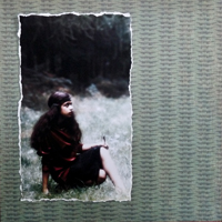
In the examples above, I have compared the effects of using three different coloured background papers. I like all three colours. Each one picks out a colour in the photo but is there one that is too patterned and distract the eye from the main image? It is essential to let the photo be the most important element.

I have chosen the green paper for my background. It emphasises the soft colours of the outdoors and doesnt detract from the image. I have chosen a torn edged floral print in soft vintage colours for my mount and accents for the same reasons. I have added some scanned vintage music as a base for my journaling block.
Next time we will be exploring the art of journaling. This is such an important part of scrapbooking and something that worries many scrapbook artists. Start thinking about the memories that go together with your favourite photos and we will make a start on journaling very soon.
Reader feedback:
Discuss this story:
Make great animated slide shows, with photo and movie clip content";
include "/home/dpnow/public_html//PHPcode/vb_includeposts.php";
?>